Start with the right logo file
The best artwork starts with a clean logo file. Vector files are ideal because they can be scaled up or down without losing detail, which matters when the same design must work on a small belt bag front panel, a tag, or a larger conference bag. If you only have a low resolution image from a website or social media, it may print fuzzy or pixelated, so send the highest quality version you have.
We can work with common file types, but the clearer the source, the better the result. If your logo includes thin lines, small text or fine symbols, these need special attention before production. That is especially important for embroidery and debossing where tiny details can close up during manufacturing.
- Best option: vector artwork with editable text
- Good option: high resolution PDF or EPS
- Use with care: JPG, PNG or screenshots
- Send all logo variations if you use different versions for light and dark backgrounds
Choose colours that reproduce well
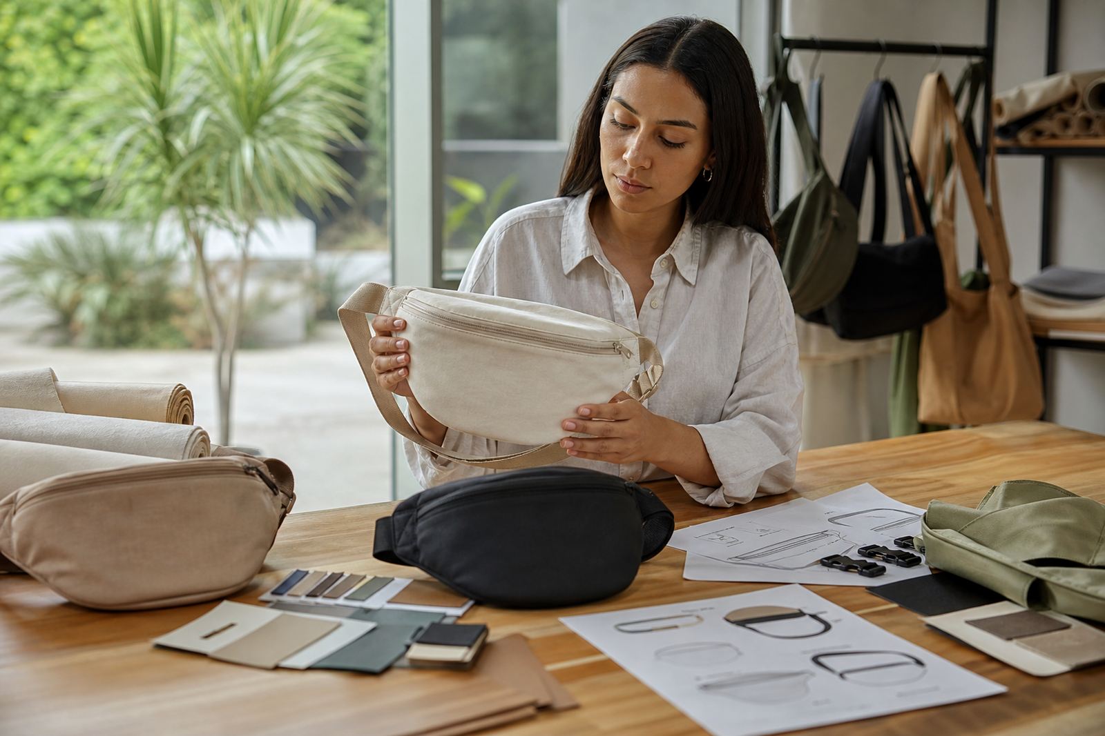
Colour always looks different on screen, on paper and on fabric. A bright blue on your laptop may print slightly darker on a black belt bag, or softer on a recycled fabric finish. For corporate events, it helps to tell us the exact Pantone, CMYK or brand colour references you use so we can match them as closely as possible. If you do not have official colour references, we can help you choose a practical print option that suits the bag material.
Some methods handle colour better than others. Screen printing is strong for bold solid colours, while heat transfer can carry more detail. Embroidery gives a premium look but very fine colour shading is limited. On dark bags, light logos usually stand out better, and on coastal orders in places like Durban or Gqeberha we often suggest colours that stay visible in bright sun and humid conditions.
- Send official colour references where possible
- Let us know if the artwork must sit on a dark or light bag
- Check whether metallic, neon or pastel shades are essential
- Ask for a sample if colour matching is critical for an event
Keep layout simple and readable
Artwork for belt bags needs to be clear at a small size. The front panel is usually compact, so long taglines, crowded contact details and tiny icons can become hard to read. A short logo lockup with enough breathing space usually works best. If the design is being used for corporate gifting or staff packs, make sure the main brand name is the first thing people see.
We recommend that all text be checked carefully before production. A small spelling mistake or a line break in the wrong place can affect the whole run, especially when hundreds of bags are being kitted for an event. If your layout includes multiple elements, we will guide you on placement so the strap, zip and seams do not interfere with the print area.
- Keep small text to a minimum
- Leave clear space around the logo
- Avoid thin borders near stitching lines
- Use one clear message where possible
Match the artwork to the print method
Different decoration methods need different artwork prep. Screen printing works well for simple logos and flat colour areas. Heat transfer is useful when you need more detail or a small batch with mixed branding. Embroidery needs a simplified version of the logo because thread has thickness and can soften sharp corners. Debossing needs clean lines and strong shapes so the impression stays visible on the finished bag.
If you are not sure which method suits your campaign, send the intended use along with your artwork. A team pack for Johannesburg may need a different finish from a VIP gift bag headed to a Cape Town conference, and rush orders may require a simpler artwork setup to keep turnaround times realistic.
- Screen printing: bold shapes and limited colours
- Heat transfer: detailed logos and smaller runs
- Embroidery: simplified marks and heavier lettering
- Debossing: strong outlines and neat spacing
What to send with your file
When you submit artwork through our contact form, include as much useful information as possible. That helps us prepare the correct proof and avoid delays before production starts. If the order is for multiple branches or an event with split delivery, tell us which items are going where so the branding stays consistent across all cartons and kitting lines.
Helpful details include:
- Your logo file in the best available format
- Brand colours, if you have them
- The bag colour and decoration method
- Preferred placement for the artwork
- The quantity needed and any rush deadline
- Any special instructions for bulk packing or event kitting
The more complete the brief, the quicker we can move from setup to production. It also helps our production and quality teams check that the artwork will work for the final bag size and material.
Proofs, checks and approval before production
Before anything goes to production, we check the artwork against the bag specification and send back a proof for approval. This is the stage where you can confirm spelling, layout, colours and positioning. Once approved, we follow the same setup for the full run so the finished order stays consistent from the first item to the last.
We also review the artwork for practical issues such as file quality, small text, colour contrast and placement near seams or zips. For large orders going to Cape Town, Pretoria or Durban, this saves time later and reduces the risk of rework. If something needs adjustment, we will explain it plainly and suggest the simplest fix, not a complicated one.
Approval matters because once production begins, changes can affect cost and timing. That is why we ask clients to check every detail carefully, even if the order is only for a small team. A clean sign-off keeps the process moving and helps the final bags arrive ready for your event.