
Start With the Bag Panel, Not the Logo
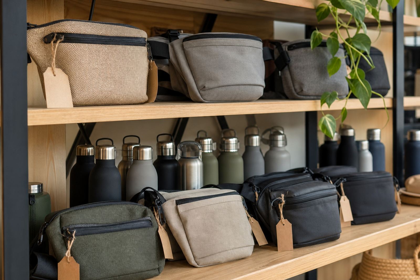
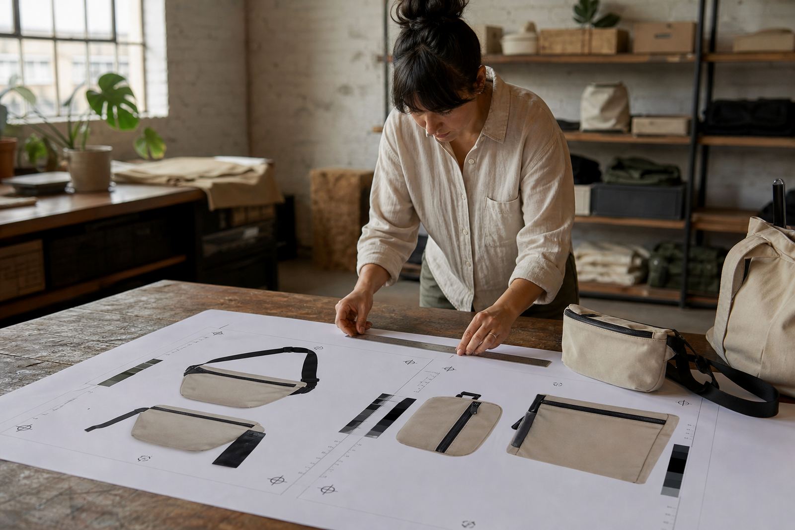
The first mistake many teams make is choosing a logo size before looking at the actual panel on the bag. A slim front panel, curved zip line or stitched edge can reduce the printable area more than expected, especially on smaller belt bags used for giveaways or event packs.
Measure the flat front area first, then leave a safety margin around the edges so the artwork does not sit too close to stitching or seams. On most belt bags, a logo that is too wide can wrap awkwardly over a zip or gusset and lose legibility once the bag is filled.
- Leave at least 10 mm clear space from seams and zips where possible.
- Keep smaller text elements away from the bottom curve of the panel.
- If the front panel is narrow, use a simpler logo lock-up instead of forcing a long version across the space.
Choose a Size That Matches the Print Method
Different branding methods need different artwork sizes, and the same logo will not always work the same way on screen printing, embroidery or heat transfer. A clean printed logo can handle finer detail than embroidery, while debossing often works best with bold shapes and strong outlines.
If your logo has a lot of thin lines, tiny type or detailed gradients, a larger size is not always the answer. In many cases, it is better to simplify the artwork so it stays readable at a moderate size and still looks tidy on the finished bag. That usually gives a better result than stretching the design to fill every millimetre.
- Screen printing suits flatter artwork with solid colour blocks.
- Embroidery works best with clear shapes and thicker lettering.
- Heat transfer can carry more detail, but the logo still needs breathing room.
- Debossing needs strong contrast in shape rather than fine detail.
Keep the Message Short and Easy to Read
A belt bag is not a billboard. If the logo includes a long company name, a slogan and a website address, the design can become too busy for a small front panel. Most event bags work better with just the core brand mark and, if needed, a short line underneath.
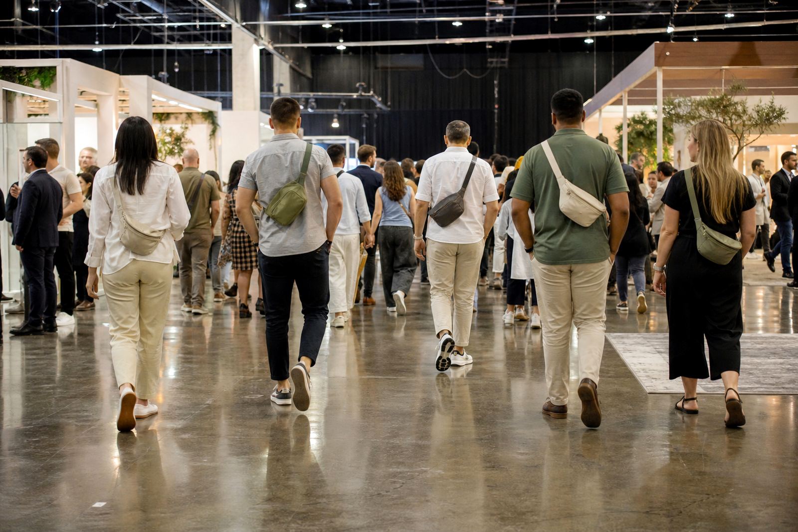
For corporate events in Johannesburg or Cape Town, where bags may be seen from a distance during registration or networking, simple branding usually performs better. People have only a second or two to notice the bag, so the logo should read quickly in low light, in a moving crowd, and even when the bag is partly turned sideways.
- Use the main logo first, not the full company descriptor.
- Remove extra wording that does not add recognition.
- Test the design at arm’s length before approving it.
- Ask whether the brand still reads clearly in black and white.
Think About the Event Use Case and Viewing Distance
The right logo size depends on where the bag will be worn. A VIP gift bag for a Durban conference may be viewed indoors at close range, while a team pack for an outdoor activation in Gqeberha could be seen from much further away. Larger logos often work well for walkabout events, but for executive gifting a smaller, more refined mark can look better.
Also consider what happens after the event. Belt bags get used on site visits, at airports, at school runs and during travel, so a logo that is too large can feel heavy-handed in daily use. A clear, modest logo tends to get worn more often, which is usually the point of branded merchandise in the first place.
- Close-up events can use smaller, neater branding.
- Outdoor activations may need bolder sizing for visibility.
- Staff packs should balance brand presence with everyday wearability.
- Client gifts benefit from a cleaner finish and less clutter.
Use One Strong Version of the Logo, Then Test It
Before you approve production, it helps to test the logo in a few sizes on a flat mock-up or sample bag. Look at it from one metre away, then from three metres away. If the name can still be read, and the logo does not swallow the whole panel, you are probably in the right range.
It also helps to compare a few versions side by side. A logo that seems perfect on screen can appear too small once it is on fabric or synthetic material, especially on darker colours where contrast matters more. In Cape Town, where coastal humidity can affect storage and handling, crisp placement and clean finishing matter just as much as the artwork itself.
- Check the logo on the exact bag colour wherever possible.
- Ask for a sample or print proof before bulk packing.
- View the artwork in daylight and indoor light.
- Confirm the logo still works if the bag is folded or partially zipped.
A Cape Town Example That Shows the Difference
We recently worked with a Western Cape team preparing for a two day event in Cape Town and Stellenbosch. They wanted the brand visible, but not so large that the bag felt like a moving advert. The first artwork version was oversized and sat too close to the zip line, which made the logo look cramped once the bag was packed with notebooks and travel items.
After adjusting the artwork to sit slightly lower and reducing the width by a few centimetres, the bag looked more balanced and the logo was easier to read. That small change also improved the finish for embroidery, because the letters no longer had to compete with the edge of the panel. It was a simple fix, but it made the bag more likely to be used again after the event.
For corporate orders in Cape Town, Johannesburg, Pretoria, Durban and Gqeberha, this is often the best approach: keep the branding clear, leave the bag room to breathe, and choose a size that suits the product rather than forcing the design to fill every space.