
Start with the job the bag must do
Before you pick a colour, be clear on what the bag must achieve. A belt bag for a staff outing in Cape Town does not need to do the same work as a conference gift for clients in Sandton or a giveaway at a roadshow in Durban. Some bags are meant to be seen from across a hall, while others need to sit quietly with a logo that carries the brand message.
If the purpose is mass distribution, a colour that hides marks and handles daily use is often the safer option. If the bag will be part of a premium package, a darker or more refined tone can make the branding feel more considered. Think about the setting, the person receiving it, and how long the bag should stay in use.
- For broad reach, choose colours that work with many outfits and skin tones.
- For client gifts, match the colour to your corporate palette or event theme.
- For staff use, pick colours that are practical for daily wear and easy to keep clean.
Use brand colours, but keep contrast in mind
Your brand colours are the first place to begin, but not every shade prints well on every bag. A logo in white, black or metallic print usually reads best on darker bag colours. On lighter bags, a darker logo gives stronger contrast and makes the branding easier to read from a distance. That matters at expo stands, sports events and busy registration counters where people only glance once.
When a brand uses several colours, the bag should not fight the logo. A bright orange bag with a red and yellow logo can look busy, while a navy or charcoal base gives the branding room to work. In many cases, one strong base colour does more for recognition than trying to use every shade in the artwork becuase the result feels cleaner.
- Dark bag plus light logo: strong visibility in low light and indoor venues.
- Light bag plus dark logo: clean, simple look for daytime events.
- Two tone or trim detail: useful when you want a branded finish without overdoing it.
Choose colours that suit the audience, not just the artwork
Different groups respond differently to colour. A youthful audience may enjoy brighter tones, while corporate clients often prefer more restrained colours such as navy, grey, olive or black. If the bag is going to operations teams, event crews or conference delegates, practical colours usually get more use because they fit into everyday clothing and do not feel too loud.
It helps to think about who will carry the bag after the event. If the recipient is likely to use it on a school run, at a stadium or on the MyCiTi bus, the colour should be versatile. If the bag is for a premium hospitality gift in Umhlanga or the Winelands, a richer finish can add value without needing extra decoration.
- Corporate executives: navy, black, charcoal, deep green.
- Campaign teams and activations: brighter colours for visibility.
- Mixed public audiences: mid-tone colours that hide wear and remain easy to pair with clothing.
Match the colour to the event setting
The venue and season matter more than many people expect. A summer outdoor event in Gqeberha or Durban has stronger sunlight, so very pale colours can show dust and handling marks faster. In Cape Town, wind, salt air and coastal humidity can also affect how a bag looks after transport and storage, so practical tones often hold up better. For indoor conferences at hotels or convention centres, the colour can be a little more polished because the lighting is controlled.
Winter events, township activations and roadshows need colours that stay neat after rain, mud or repeated handling. If the bags will be packed into cartons, moved between branches or distributed over several days, choose shades that do not show scuffs easily. A colour that looks great in a sample room but not after a week in a vehicle is usually the wrong choice.
- Outdoor summer events: mid or dark tones reduce visible wear.
- Indoor conferences: deeper colours photograph well under artificial light.
- Travel and courier distribution: darker shades are more forgiving on transit marks.
Think about printing method before you finalise the shade
The bag colour must work with the branding method. Screen printing gives strong solid colour, while heat transfer can handle finer detail and more complex artwork. Embroidery looks best when the thread stands out clearly against the bag fabric. Debossing, by contrast, is subtle and often suits darker or textured finishes. If the logo is small, a colour with good contrast becomes even more important.
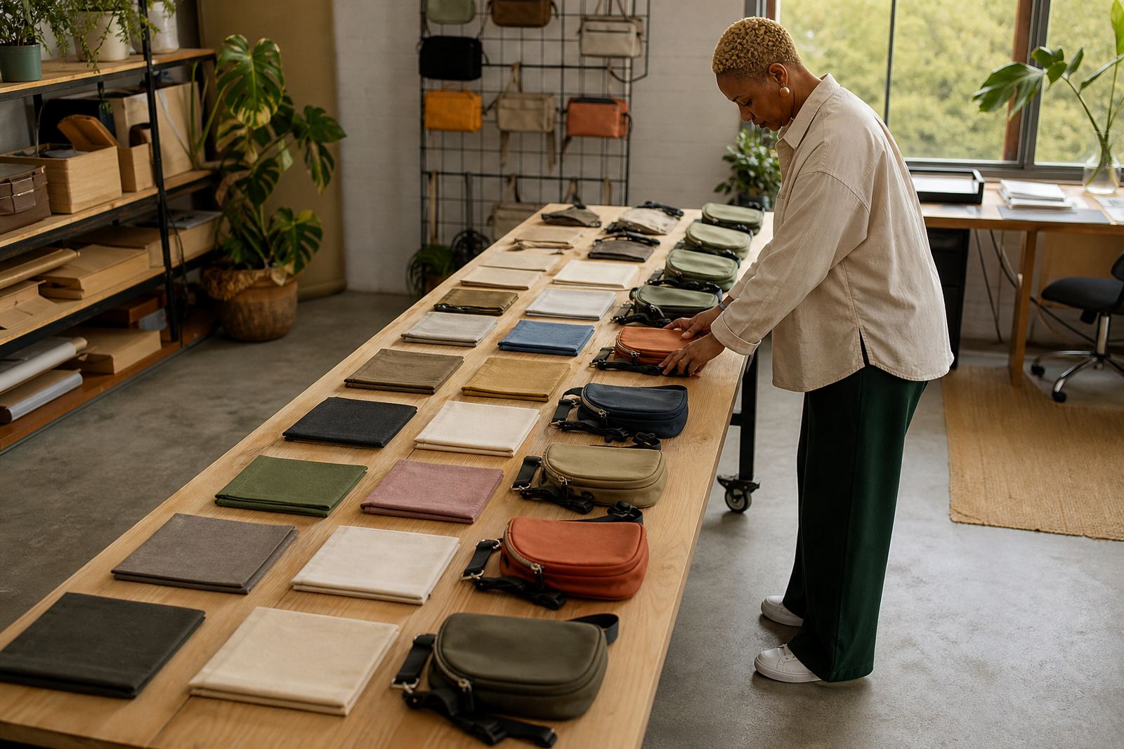
Some colours also make artwork look softer or sharper depending on the finish. A matte navy bag can make a white logo crisp and professional. A pale stone colour may suit a minimal logo, but it may not carry fine detail as well. It is worth checking a sample before approving a large run, especially when the bags are being used for client packs or split delivery across multiple cities.
- Embroidery: works well on darker bases with clear contrast.
- Screen printing: best when the logo needs to read from a distance.
- Debossing: suits understated branding and textured materials.
Practical colour choices for South African events
There is no single correct colour for every campaign, but there are sensible defaults. Black remains a safe option for most corporate uses because it is tidy and easy to coordinate. Navy is a strong second choice for finance, professional services and internal events. Grey gives a neutral look that sits well across industries. If you want the bags to feel warmer, olive or forest green can work well without looking too informal.
For a local example, a Cape Town company running a year-end staff event might choose black belt bags with white logo printing for a clean look that will still be useful after the party. A Johannesburg conference team may prefer charcoal bags with a silver print so the packs look smart under bright hall lighting. In Durban, where humidity and travel can be harder on fabric, darker shades often stay presentable for longer. The best colour is usually the one that suits the use, the audience and the budget, not just the mood board.
- Use dark colours when durability and resale of the item matter most.
- Use light or bright colours when visibility and campaign energy matter most.
- Use neutral colours when the bag must suit many departments or mixed audiences.