
Start with the purpose of the bag
Before you choose a colour, decide where the bag will be used. A colour that works for a golf day in Somerset West may not be the best fit for a formal conference in Sandton or a staff gifting day in Durban. The purpose should guide the tone, and that keeps the final result practical instead of guesswork.
If the bag is for a corporate event, think about whether you want it to blend in with the venue or stand out in a crowd. A neutral bag is often best for broad use, while a brighter option can lift the mood at launches, roadshows and year end functions. If the bags are for regular team use, darker shades usually hold up better to dust, handling and daily wear.
- Event gift: choose colours that feel neat in photos and on stage
- Staff use: choose darker colours that hide marks better
- Client giveaway: choose colours that match your brand palette
- Premium pack: choose a colour that feels clean and ordered
Match colour to your brand identity
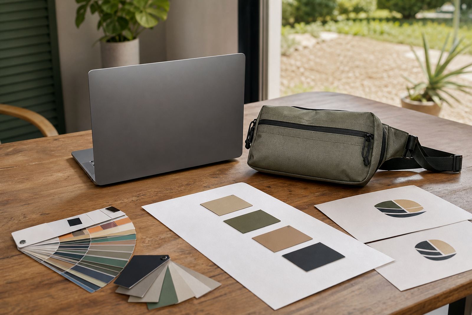
Your bag colour should sit comfortably next to your logo, not fight with it. If your brand uses a strong colour already, a simpler bag shade often works best because it gives the logo space to read clearly. Where the logo has multiple colours, a plain bag colour can stop the whole item from looking busy.
For logo visibility, contrast matters. Light logos usually show well on dark bags, while darker logos need a lighter base. This is especially important when the bags are being handed out at a busy venue or split across branches in Cape Town, Johannesburg and Pretoria. Keep the final print area in mind too, because a good colour choice can make artwork look sharper with less effort.
- Use dark bags for pale logos
- Use light bags for dark logos
- Keep busy patterns to a minimum
- Check how the logo looks from 2 to 3 metres away
Choose shades that suit the event atmosphere
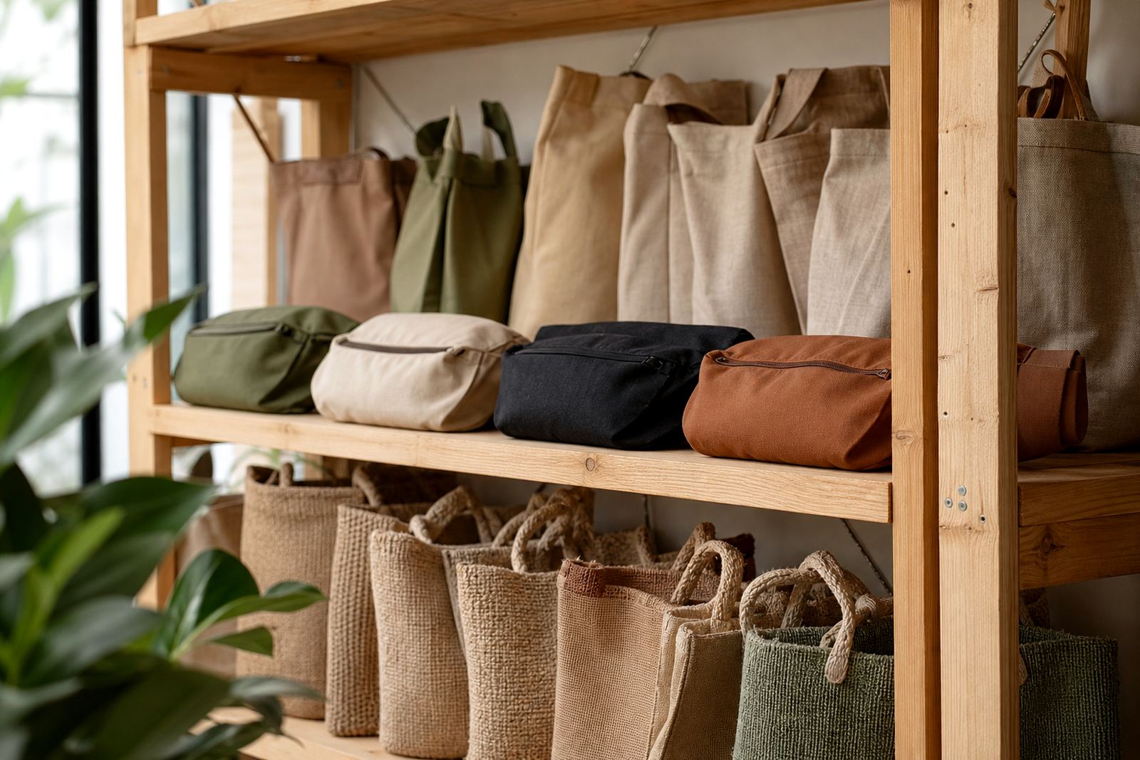
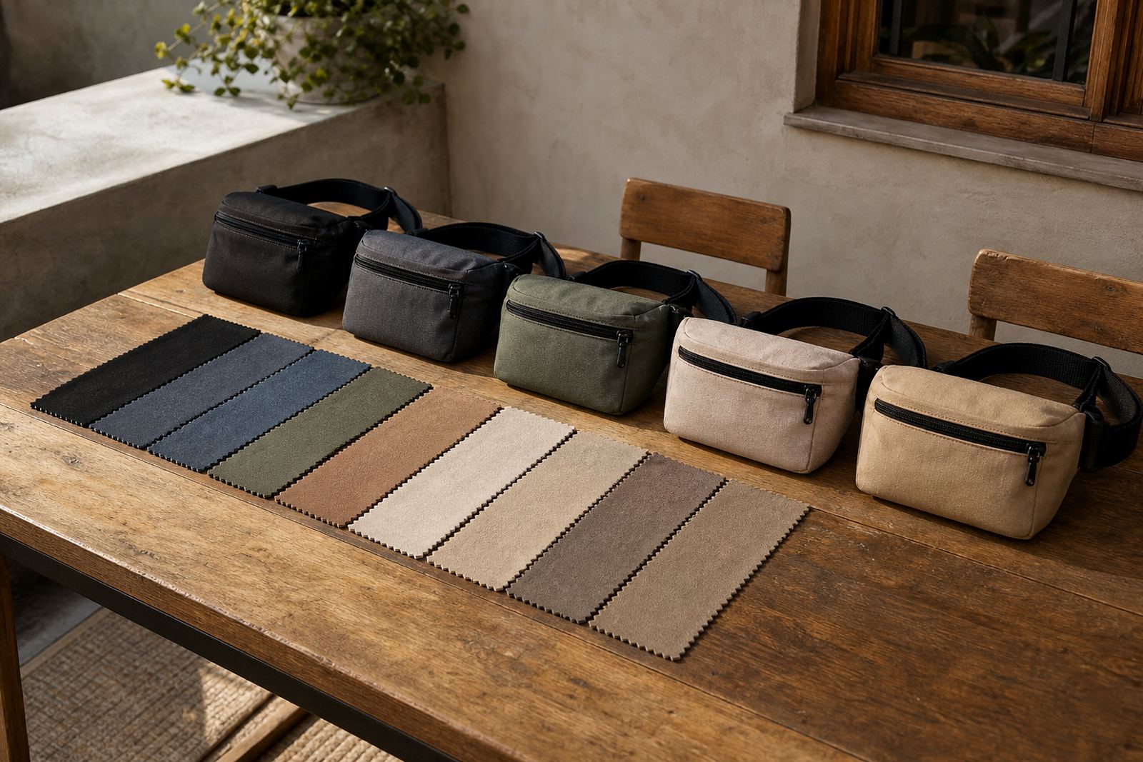
The colour of a belt bag can change the feel of the whole event kit. Black, navy and charcoal give a steady corporate look and suit formal settings. Olive, sand and stone can work well for outdoor events, product activations and travel packs. Brighter colours such as red, royal blue or lime can add energy where the event needs more visual movement.
In Cape Town and Gqeberha, coastal humidity can affect how people handle bags during outdoor events, so a shade that hides damp marks is often useful. In Johannesburg and Pretoria, dust and travel wear can show quickly on pale materials. A practical colour choice saves stress later and helps the bags still look good after the event. Sometimes the best choice is the one that stays neat after a full day on site.
- Formal event: black, navy, charcoal
- Outdoor event: olive, stone, sand
- High energy event: red, blue, lime
- Long use: colours that hide scuffs and fingerprints
Think about print method and finish
Different branding methods can change how a colour appears. A screen printed logo usually needs a solid colour base for clear results. Heat transfer can work well when you need fine detail. Embroidery, debossing and other finishes also react differently depending on the bag shade and material.
Matte finishes often give a calmer, more professional result, while brighter or glossier surfaces can feel more promotional. If you are planning a large order for event kitting, ask for a sample first so you can see the colour in proper light. What looks fine under office lighting may look a bit different in a hall, under tent shade or in bright daylight.
- Confirm the print method before approving the colour
- Check the colour in natural light and indoor light
- Ask for a sample if the order is for a big event
- Make sure the finish suits the tone of the event
Use a simple checklist before approving the order
A short checklist can prevent expensive mistakes. The right colour should support the logo, suit the audience and work with the event setting. It should also be practical for packing, dispatch and repeat use, especially when the order is moving between branches or going out in split deliveries.
If you are ordering for multiple cities, keep the colour choice consistent unless there is a clear reason to vary it. Small changes between batches can be hard to notice on a screen but very obvious when the packs arrive. A quick check now saves time later and keeps the order tidy from start to finish.
- Does the colour match the brand tone?
- Will the logo stand out clearly?
- Is the colour suitable for the venue and season?
- Will it hide marks during transport and use?
- Have you checked the sample against the final artwork?
Plan colours for mixed packs and multi branch events
Some orders need more than one colour. You may be preparing welcome packs for executives, staff bags for a conference team, and client giveaways all at once. In that case, use one main colour family and vary the details carefully so the set still feels linked. This keeps the final delivery orderly and avoids a mix that feels random.
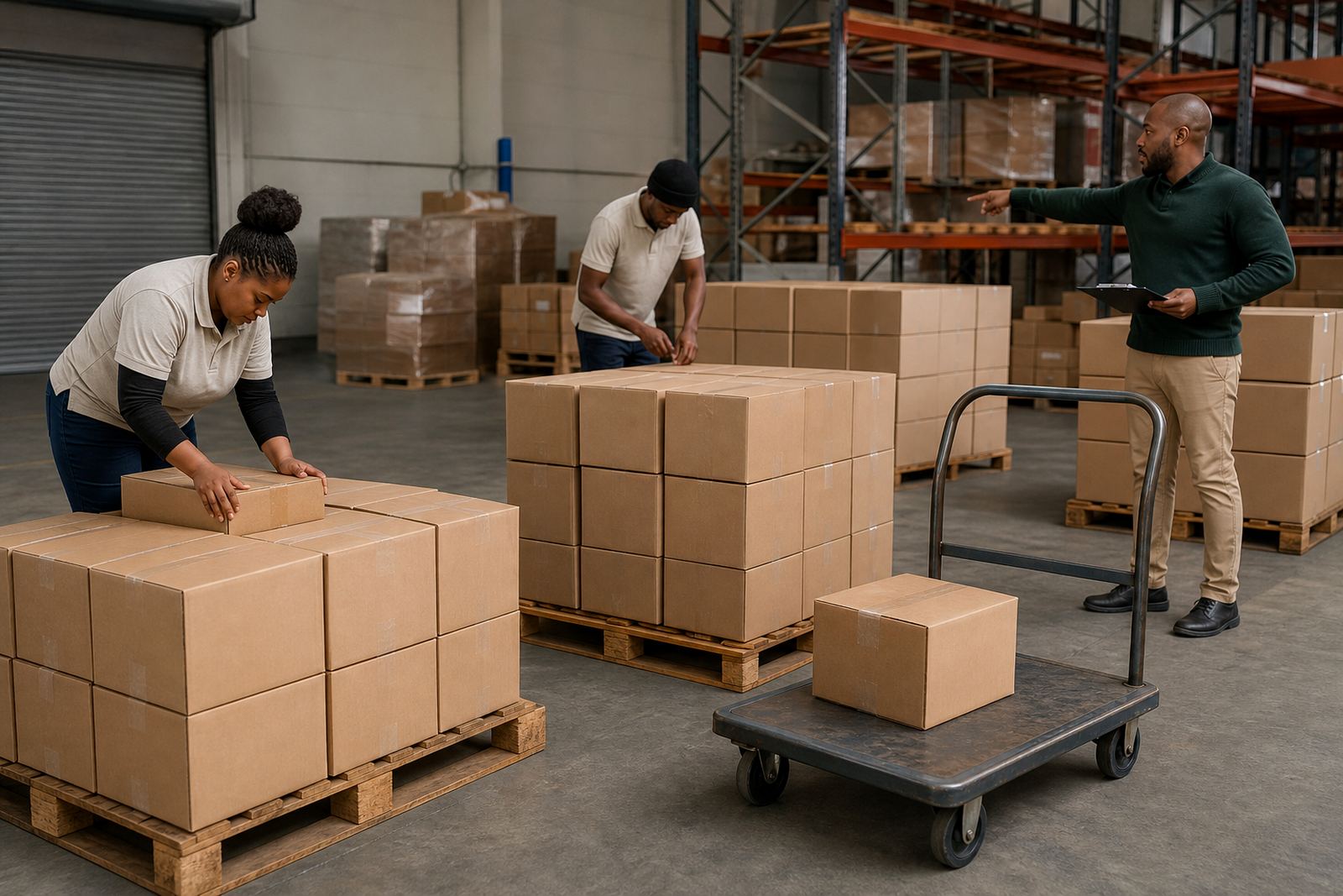
For larger rollouts, colour coding can also help with sorting and distribution. A darker bag for one group and a lighter bag for another can make it easier to manage event kitting, bulk packing and delivery to different locations. This is useful when the event spans Cape Town, Bellville, Somerset West, Johannesburg, Durban or Gqeberha, because teams need to identify stock quickly without opening every carton.
- Use one main colour family across the order
- Vary only one element at a time, such as trim or print colour
- Mark cartons clearly for each delivery point
- Keep one person responsible for final colour approval